Project brief
The main aim of the interactive whiteboard: provide a powerful experience with a simple interface for online meetings. To enhance the value and effectiveness of the product, HeyHi sought a strong identity to differentiate themselves from other similar products in the market. They needed to give users an experience that is friendly and enjoyable. More details of the client's experience is on our blog.
Creating a brand
HeyHi gave us a rundown of the product and shared their goal of providing teachers and students a seamless online experience through an online whiteboard with video conferencing. They wanted their brand to be intuitive and welcoming to these users.
Creating the brand’s identity
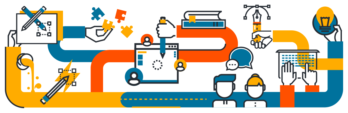
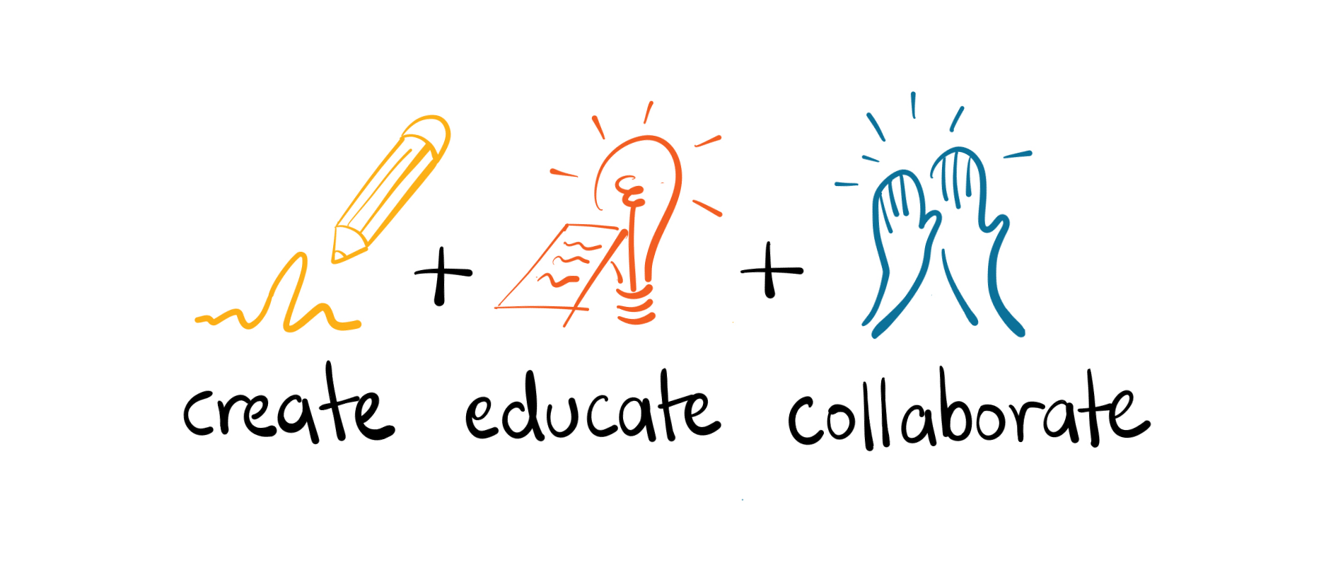
Our team started to brainstorm ideas to figure out the brand’s identity. During our initial research, we used the product to understand it more and scope the market they were in. We dug deeper to find out how branding could close the gap between the product and its users. Using the information gathered from the client and our extensive research, we created a brand that presented its core values of creation, education and collaboration.
Product positioning
These values helped clarify the end goal of the video conferencing tool: to facilitate genuine connection and creative collaboration resembling in-person participation as closely as possible. And this was what made the product stand out in the market.
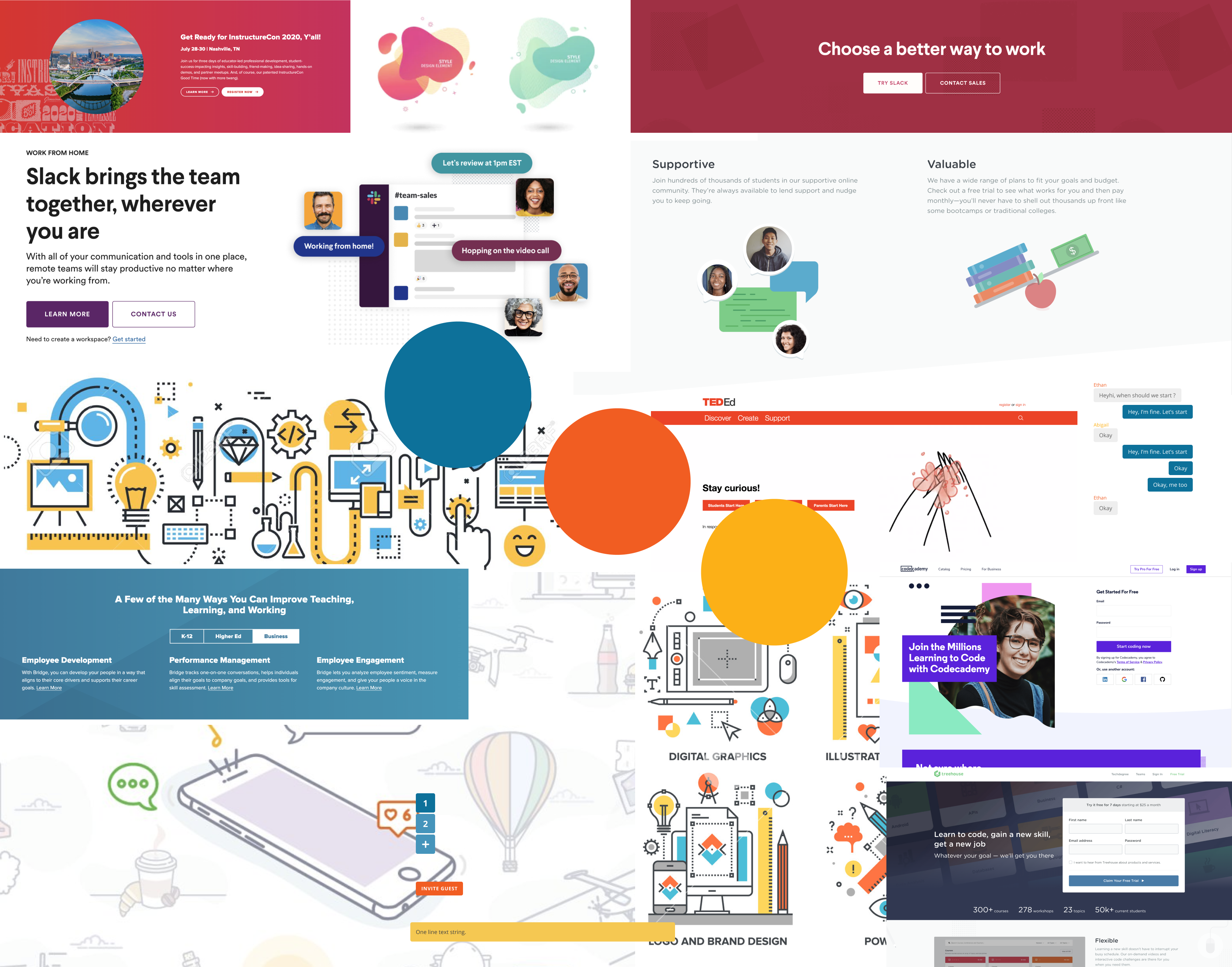
We then placed the characteristics of the product on a brand personality framework to figure out the brand positioning and direction Heyhi should take. As the target audience also included students, the team proposed a modern and positive energy, while representing the trust and reliability of an educational tool. Afterwards, we created a mood board to share our concept with the client. It helped them to visualise how the brand might end up looking.
Creating different concepts
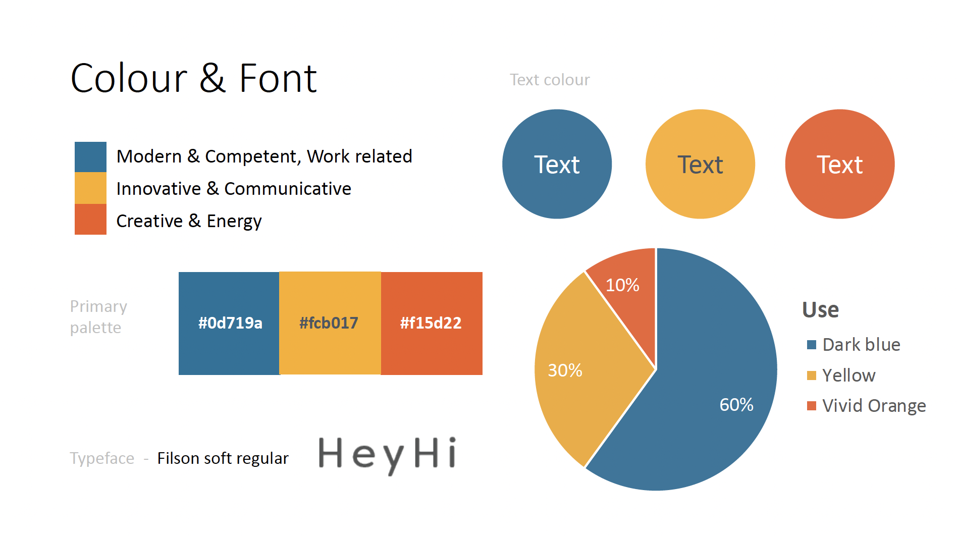
We came up with colours and their usage ratio to not only portray energy and creativity but also competency. At the same time, we churned up with a few concepts that we ran by the client. After a few rounds of feedback and discussions, we ended up focusing on the core aspects of the product, which were so completely different from one another yet part of the product. The tricky part was to showcase all these in the logo.
Refining the logo
Our team started on a series of sketches that were internally reviewed and tested. We came up with a few raw sketches that we ran by the client and finally ended up focusing on the one they preferred the most. Still in its unrefined stage, we started working on refining the concept. We went further to address different tones, text styles and designs that might portray the values better. Focus was also given on the balance and the structure of the logo.
By working closely with the client and having regular discussions with them, we ensured that feedback was timely and stakeholders were satisfied with the logo and brand identity we proposed. With this, we were able to create a look and feel that matched the energy behind the product name and finalise the logo!
Creating a digital brand
We made sure to create different styles of the logo to accommodate different use cases like favicons like browser, monotones for print work, etc. To make sure their branding was reflected everywhere, we made a series of digital templates from name cards to presentation templates that they normally used in their operations.
But we didn’t just stop there, we made sure the branding was reflected everywhere in the present and the future too. Our team created a brand guide that the client could use to facilitate their future brand creations. The document makes sure that the company’s visual identity remains consistent throughout all forms of public facing communications by including rules and guidelines that set forth a consistent language and tone.
Our final act was to make sure that all the outputs like logo files and templates were easy to access and use.

