Project brief
SpudnikLab, a digital media consultancy that focuses on bridging the digital divide required a logo design and user research for their platform, Kobi.
Kobi reviews apps designed for users with KaiOS phones, phones used in areas with limited connectivity. It helps their users find the apps they need by giving a thorough analysis of an app that suits their specific needs. Therefore, the unique challenge was to make sure that the logo we created would convey their mission and emote the right experience for their users.
Creating a brand
We started off by understanding what SpudnikLab wanted in terms of expectations. They provided initial details such as the expected timeline, brand description and references for the kinds of designs they liked.
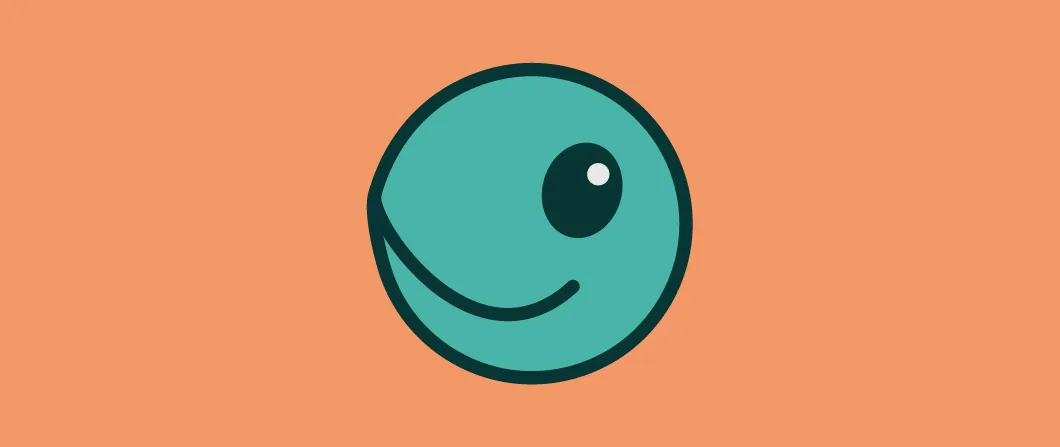
After more conversations with the client, we gained a deeper understanding of why they wanted a leatherback turtle. It was conceived as a helpful turtle guide, swimming across the space of the universe to find useful information to benefit users’ lives. This turtle would be helpful, cheerful, and friendly. That helped us determine how we could go about our research.
Having to stylise a real turtle into a graphical element, we had to dig deeper into how the real creature behaved as well as match the values and characteristics it had to represent. Kobi is a mascot type of logo, which means it represents figures, faces or characters, and acts as the brand ambassador. The focus on its expressions mattered.
Using characteristics of the product and SpudnikLab’s input, we placed the characteristics on a brand personality framework (shown above) to figure out the brand positioning and direction Kobi should take.
After further research, we created a mood board to convey our ideas with the client. Once everyone was internally aligned with the direction of the design, we went on to the next phase, brainstorming.
We spent a few days brainstorming different ways Kobi could be represented using a brain dump, pouring out as many concepts as we could. After a few internal group reviews, we went from many concepts to a few suitable ones which were gesture, expression, and navigation.
Once we finalised our concepts, we moved on to sketching them out. We researched and incorporated various turtle positions and visualisations to design more realistic sketches. We also made sure to focus on 55 Minutes’ five principles when designing the logos: scalability, simplicity, relevance, harmony and versatility.
After a few rounds of internal and external reviews, we narrowed down the final, detailed concept to show our client.
During user interviews, we asked users what they thought of the logo and what was conveyed to them to check if the logo represented helpfulness, cheerfulness, and friendliness. This is what our users had to say:
Participant B — Cheerful, because the turtle is cute/because of the turtle’s smile
Participant E — Friendly, because the mascot looks like it can be a friend

