About the project
Temasek Foundation 2022 Annual Report was a collaborative project between 55 Minutes, Tuber Productions and Nine Tales. Tuber set the visual identity and overall art direction of the website, while 55 Minutes was in charge of the UI/UX of the website. Nine Tales was our development partner for this project. Our focus and goal for this project were to ensure:
- The website was easy to use
- The content was easy to navigate
- The website was accessible
Ease of use
1. Consistent structure and user interface elements across the pages create patterns and repetition to help users familiarise themselves with the website quickly. For example, all the main story pages contain a header with an image and title, body, programme overview, sections linked to the SDGs and side stories, pagination, and story slider. By repeating these elements, users know what to expect and have a better experience browsing the website. Consistent page structure and user interface elements also create a stronger visual identity.
2. Clear hierarchy and strategic placement of visuals are used to increase the readability of the story pages. A few body paragraphs are grouped under a heading with a bigger size in a more stand-out purple colour. It is done to establish the hierarchy of the story and avoid the wall-of-text effect. Images and videos are also strategically placed to break the text into smaller chunks to make it easier to read.
3. The website is designed to be responsive and cross-browser compatible. The website must function properly on different screen sizes and be compatible with all common web browsers. The navigation resizes to different sizes; text, images and videos automatically reformat and resize accordingly. For example, some of the longer sections of the website are condensed into vertical collapsible tabs on mobile.
4. Clear call-to-action buttons are added to various website sections to describe the next step for users. The meaningful button text copy sets clear expectations of what content the users are led to.
Navigable content
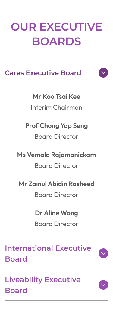
1. The links on the main navigation are grouped according to their category. For example, Board of Directors is put under Leadership, and the story pages like "Eradicating a ‘Silent Killer’ in Singapore with Vaccination" are grouped according to Temasek Foundation's Pillars (Synergy in Communities, Synergy in Partnerships, and Synergy in Innovations). The groupings help users quickly scan and easily access the story they are interested in.
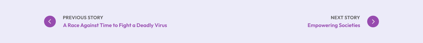
2. Story page pagination is added near the bottom of each story page to give users the option to read the next or previous story, making it easy for them to go forward or backtrack. The stories are paginated in the order of their appearance on the main navigation to create a consistent experience.
Accessibility
1. Readable text size – Since the Annual Report is story-based and contains many texts, ensuring the text size is readable across the device is essential during the design stage. Each paragraph also maintains a line length that promotes comfortable reading.
2. Colour contrast – Some of the colours included in the visual identity do not provide a solid enough contrast to make it accessible to people with visual impairment. To remedy this, we expanded the website's colour system and ensured light texts are always on the darkest area of the website and vice versa.

