Project brief
User research
The three groups of users shared similar needs and pain points: they wanted to set up an online meeting quickly, and be able to carry out creative and collaborative activities like ideation, sketching, writing, and chatting, simultaneously without having to switch between different tools. We had to make sure to design with all these goals in mind and also to provide a gentle learning curve for the users at the same time.
Creating a brand
Using the information gathered, we focused on creating a brand that presented its core values of creation, education, and collaboration. As the target audience also included students, the team proposed a modern and positive energy, while representing the trust and reliability of an educational tool. By working closely with the client and having regular discussions with them, we ensured feedback was timely and stakeholders were satisfied with the logo and brand identity we proposed. With this, we were able to create a look and feel that matches the energy behind the product name.
Wireframes and user journey
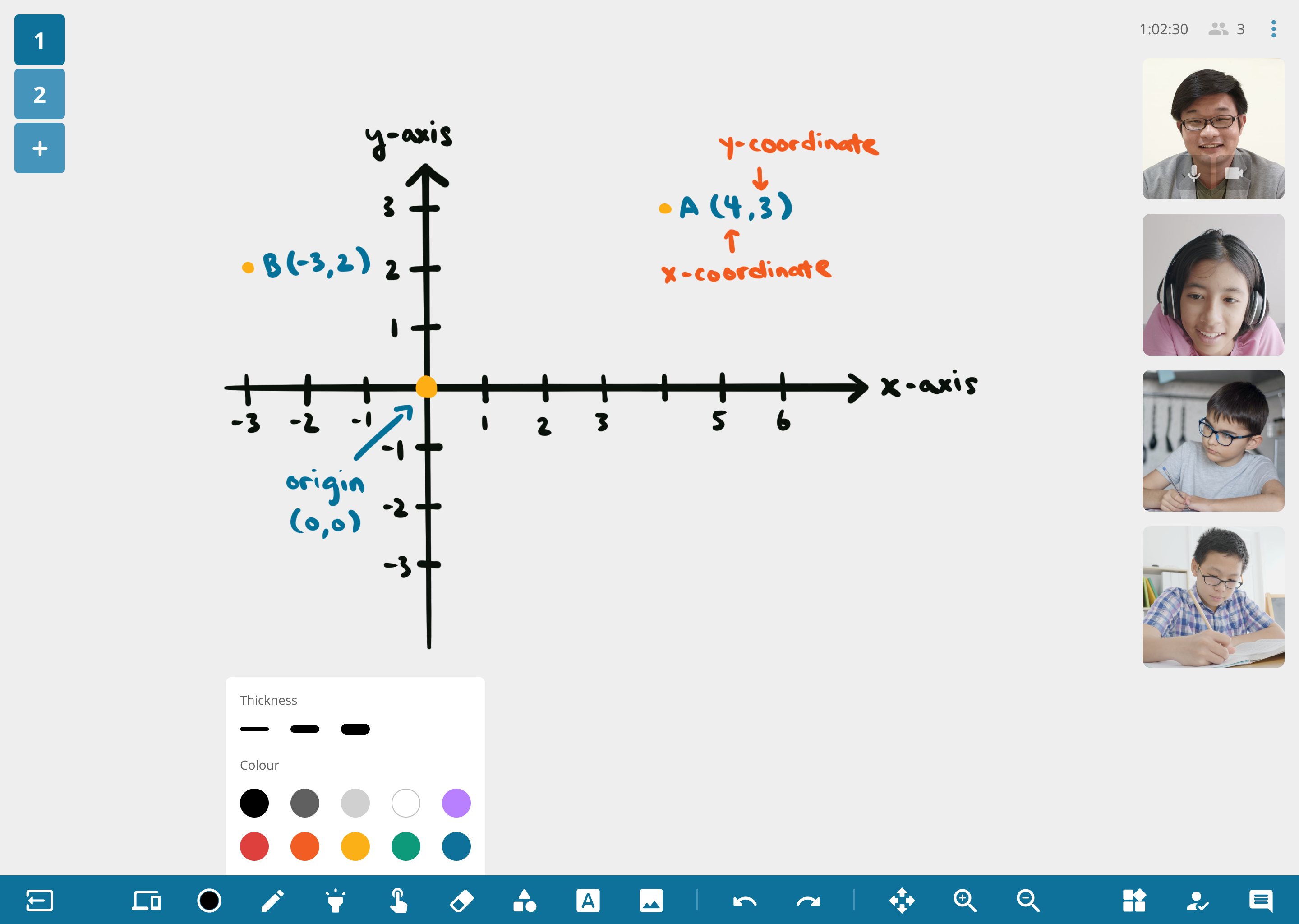
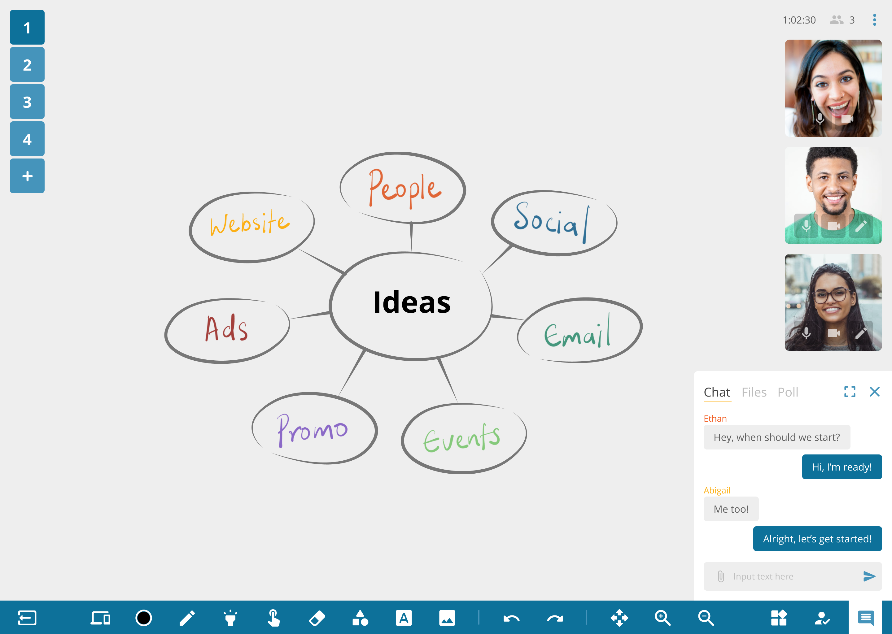
We refined the app features to suit the brand’s philosophy. Knowing that the interactive whiteboard is key to user interactions, we carefully considered various possible user scenarios and designed over 20 features to be easily understood by all types of users. Our priority was to simplify the user journey and boost the productivity of the users, while rectifying and decreasing the potential errors that users might face.
As the product was going to be used across different operating systems, responsiveness across different devices was crucial. We created a clear information architecture for the app to ensure users could use it with ease and confidence regardless of the device they are on.
User interface designs
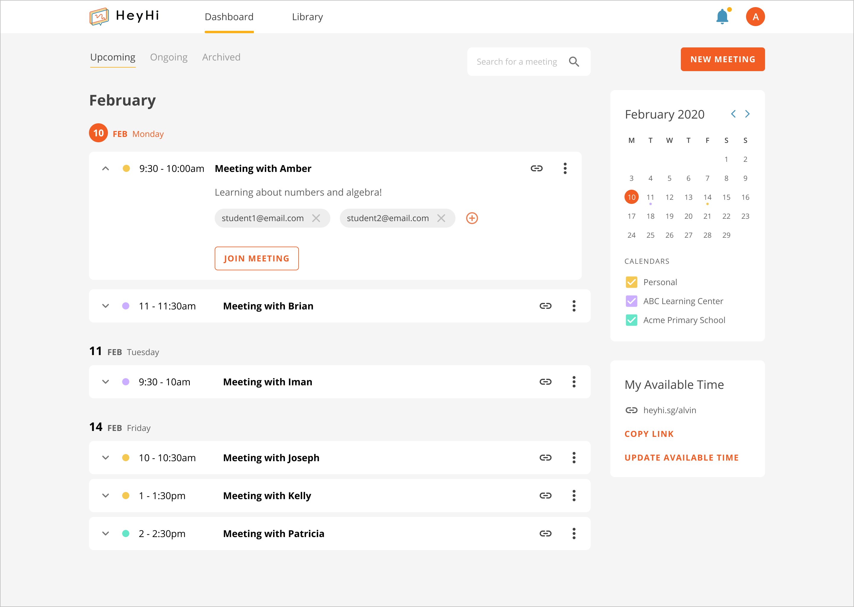
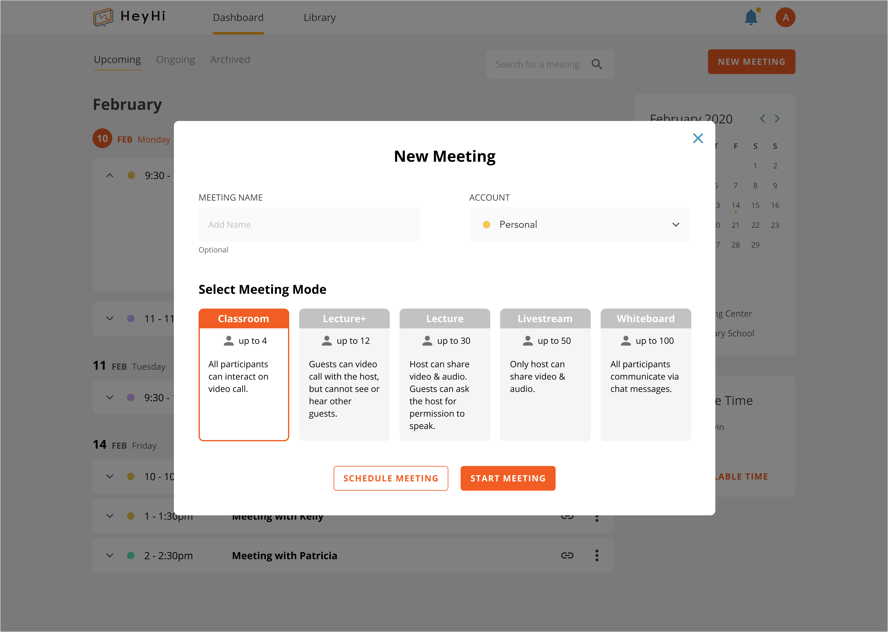
This product supports many features and its target users consist of meeting hosts and participants interact with different elements at different points of their user journey. As such, the team had to be adaptable towards how we designed each feature during the development phase. At times, there were additional updates to features that we had already worked on, therefore we had to work with a model that was scalable. By streamlining all the components used throughout the interfaces, we ensured that the product was scalable by increasing its adaptability towards new features.
Our team also prioritised the simplicity of the product. With research and close discussions within the work team, we designed user interfaces in a way where it'd be simple to understand and easy to use. At the same time, brand elements representing HeyHi were often integrated. We conscientiously introduced suitable gestures, animations and visual designs that would add value to the whole experience being easy to interact with.where necessary.
To help clients visualise the final product, instead of only designing static UI screens for the app, we created working prototypes to better demonstrate our ideas.