Project brief
As part of the Potato Productions group of companies, 55 Minutes was tasked to redesign Potato Productions’ company website. The main objectives of the redesign were:
- To build brand credibility
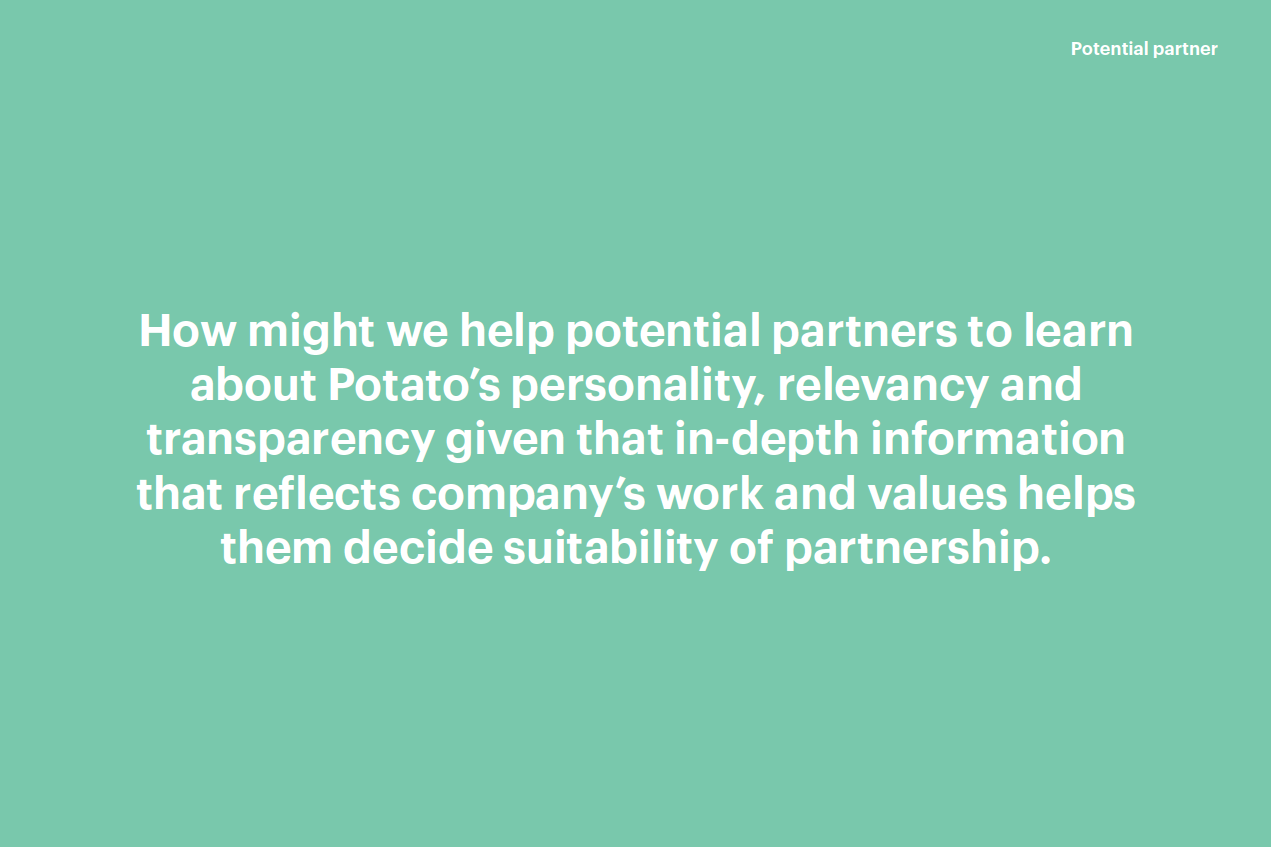
- To establish Potato Productions as a known player in the innovative space, be relevant to people in the industry, and attract potential employees, partners, and clients to both Potato Productions and its subsidiaries
Some of the pain points brought up by the client were:
- The existing website was bare and lacked personality - it didn’t provide sufficient information about Potato and its companies or engage audiences.
- The existing website lacked substance and didn’t lend credibility to our companies or our work.
- The website lacks functions for searchability so audiences are unable to find information relevant to their interests.
User research
User interview
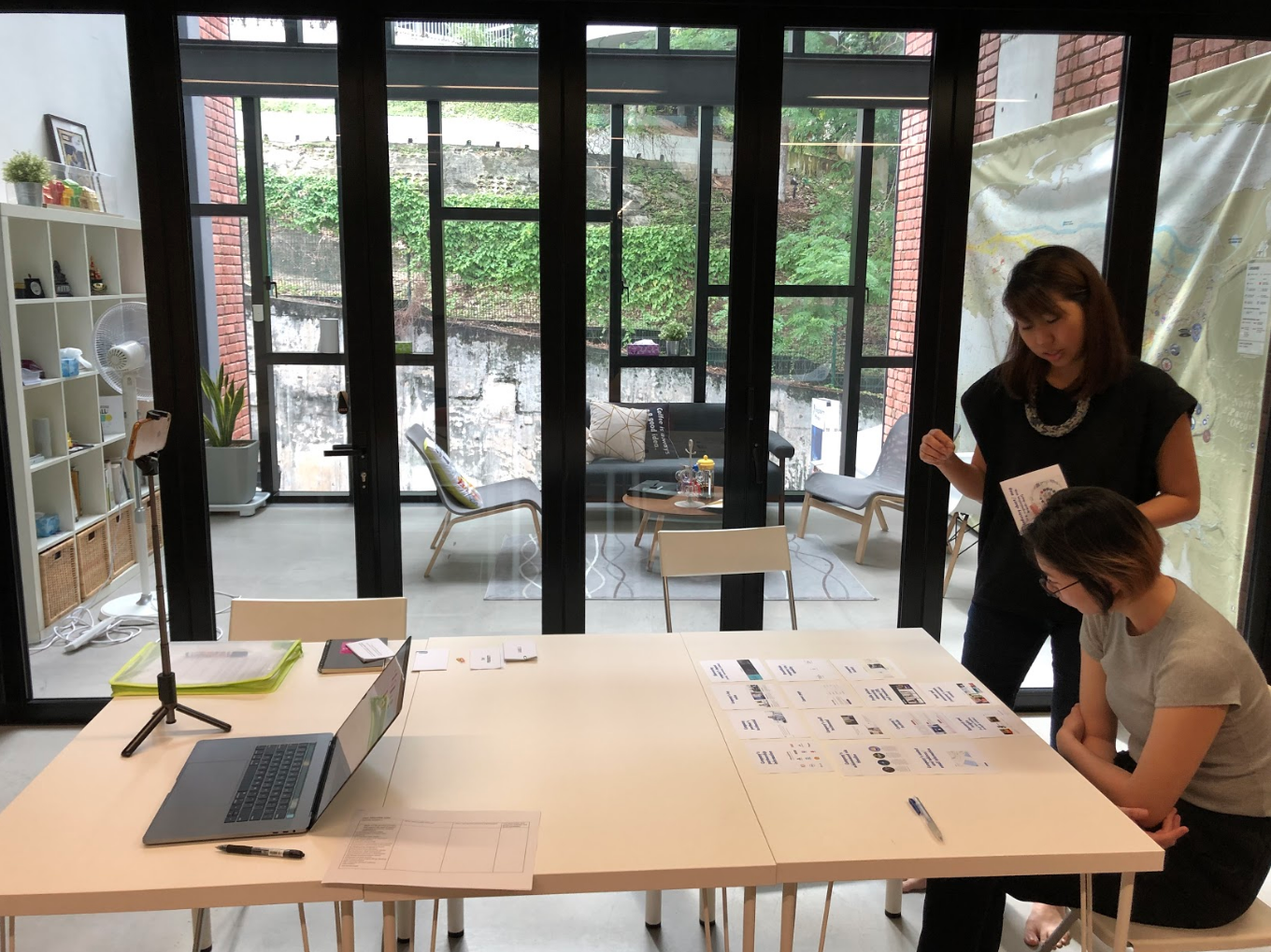
Interview analysis
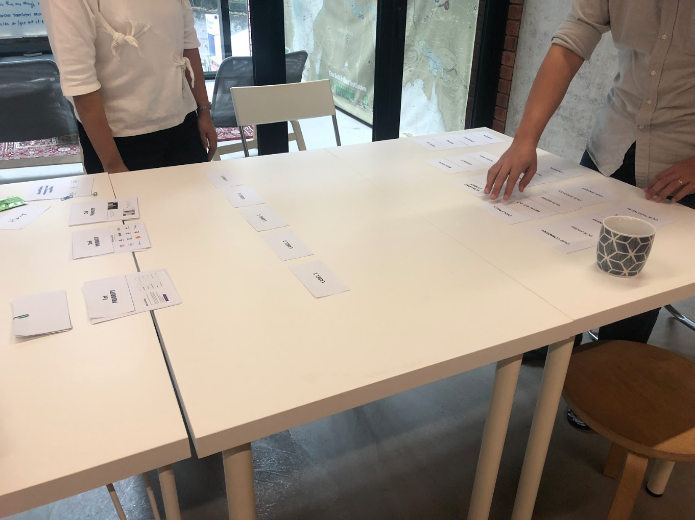
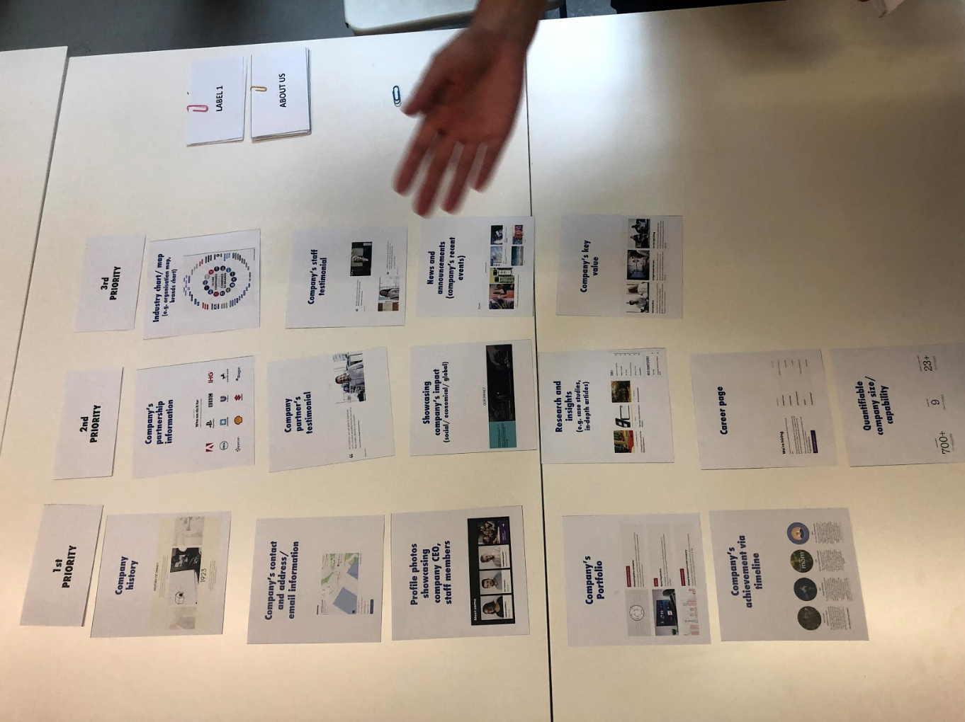
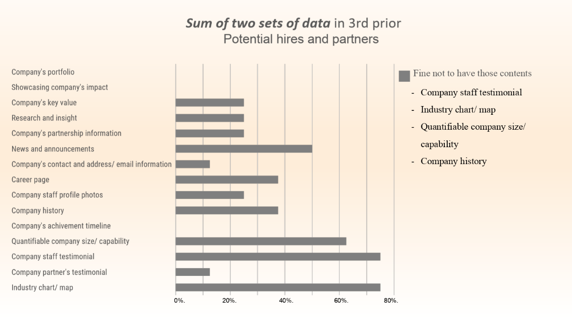
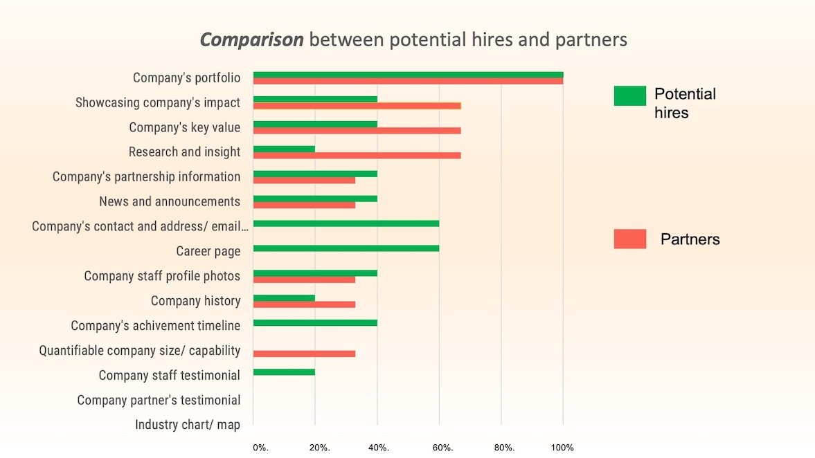
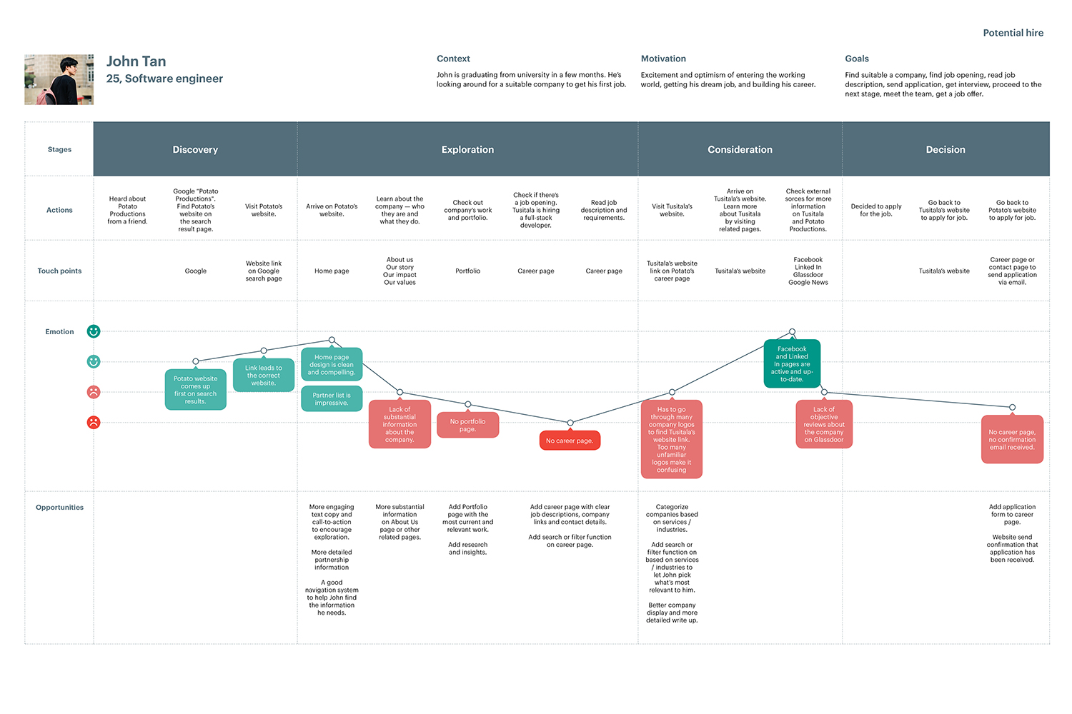
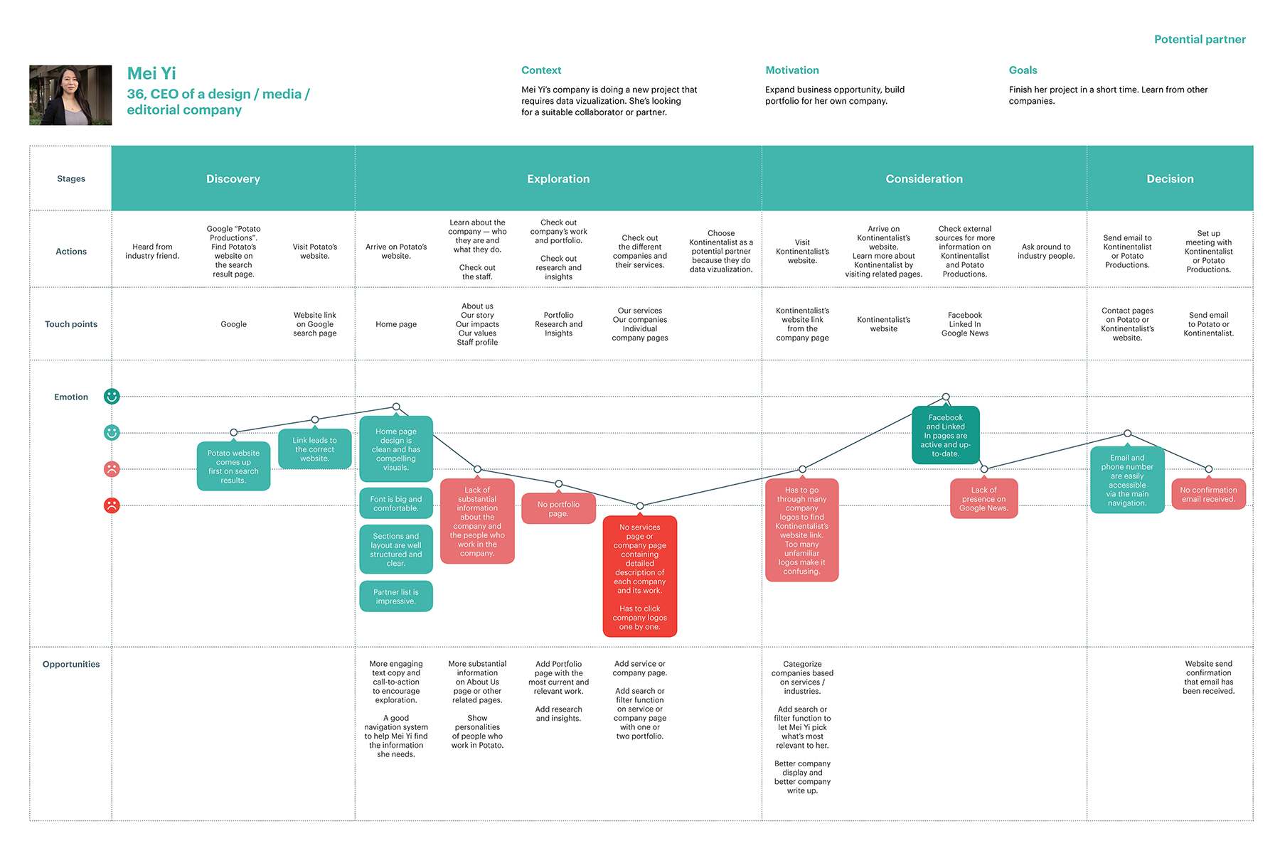
After all the interviews were completed, our research team came up with different sets of data to present to the client. These sets of data were also used later to construct user persona cards and user journey mapping. Through the interview results we discovered that both participants from the potential hire and partner group saw an attractive portfolio page as the most important part of a company website. Company values and impacts were also among those valued highly by the interview participants.
Persona and user journey mapping
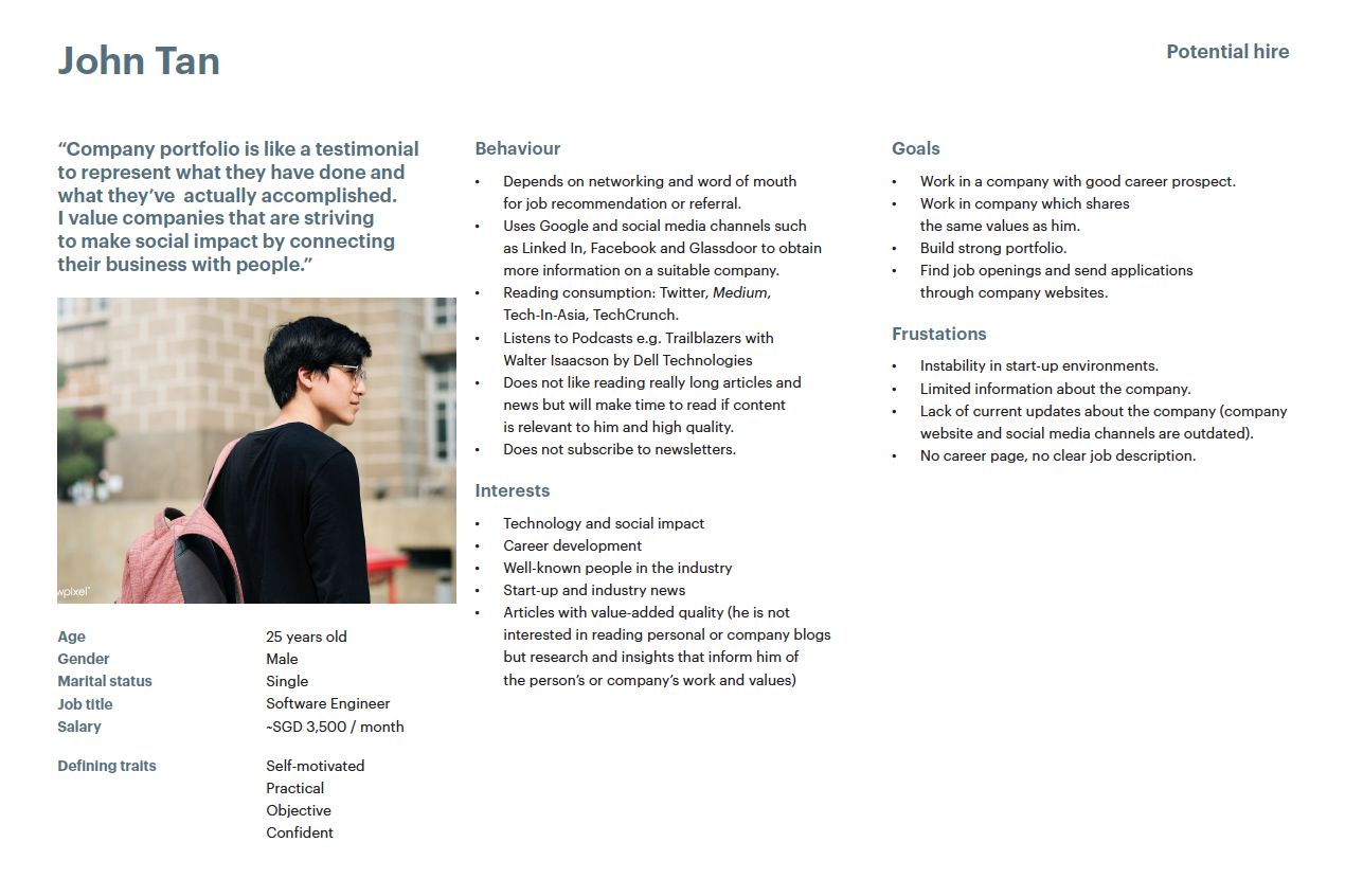
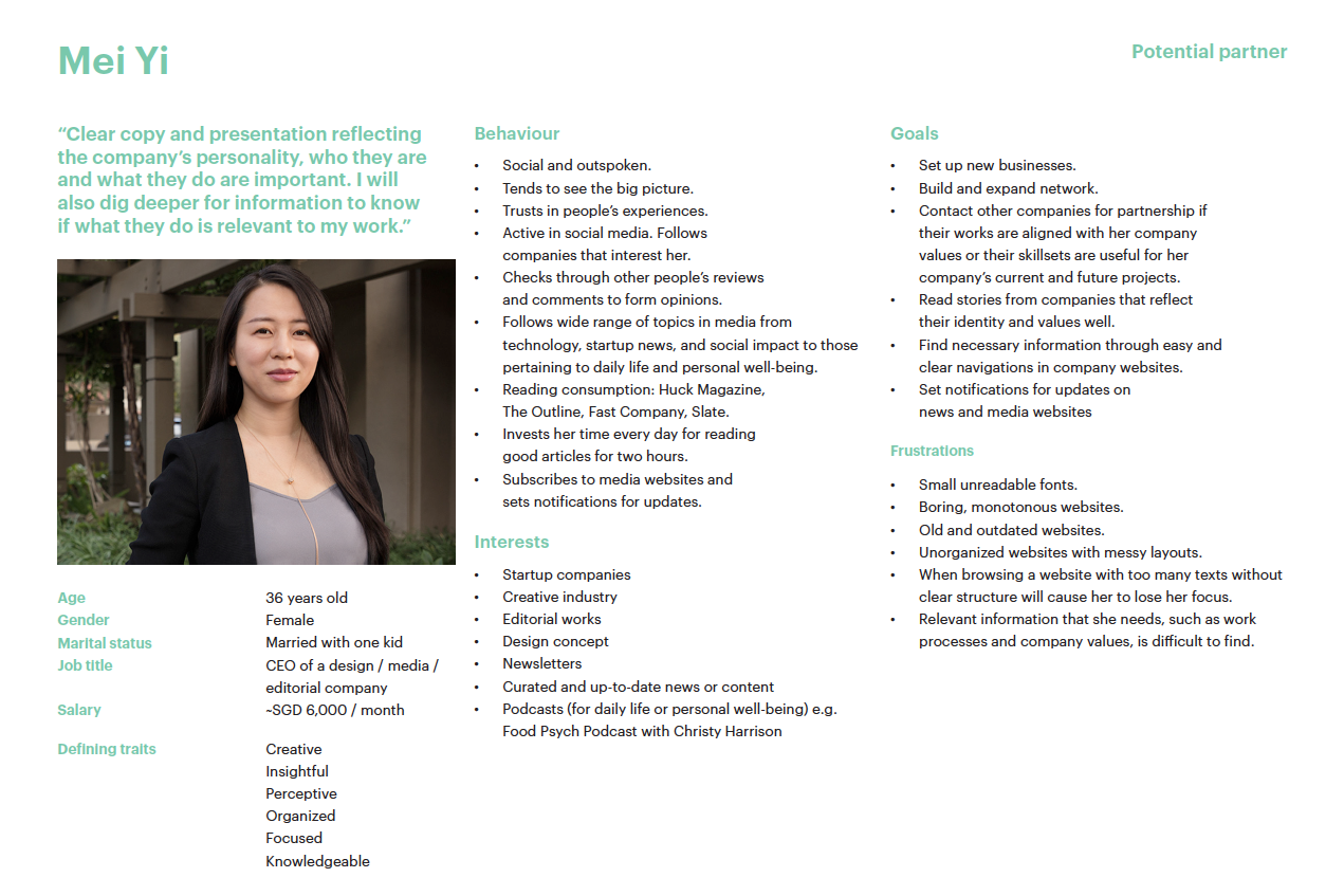
Based on the interview analysis, we crafted two different personas, one for each user category: John Tan, the potential hire and Mei Yi the potential partner.
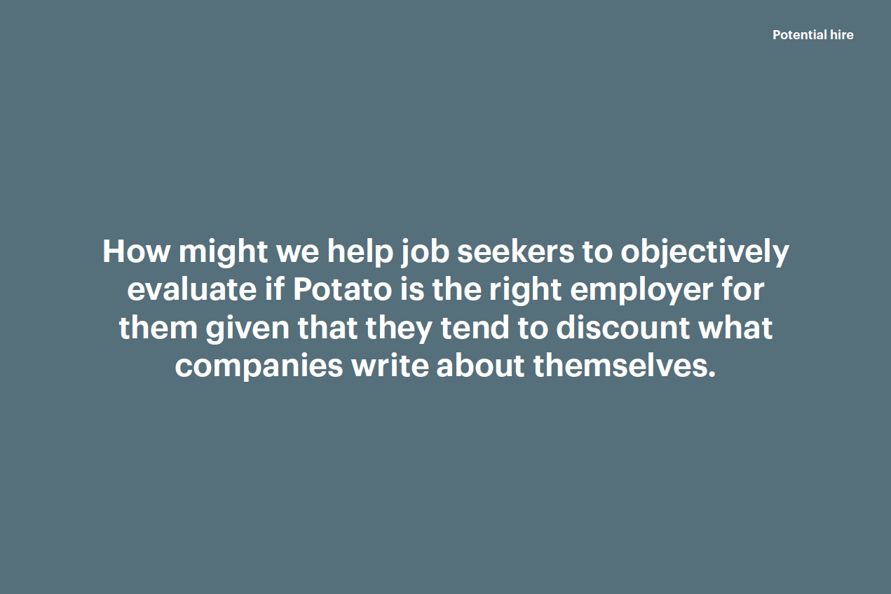
John Tan’s profile was a combination of the five interview participants who belonged to the “potential hires” group, while Mei Yi was a combination of the other three participants who belonged to the “partner” group. We also crafted a specific problem statement for each persona.
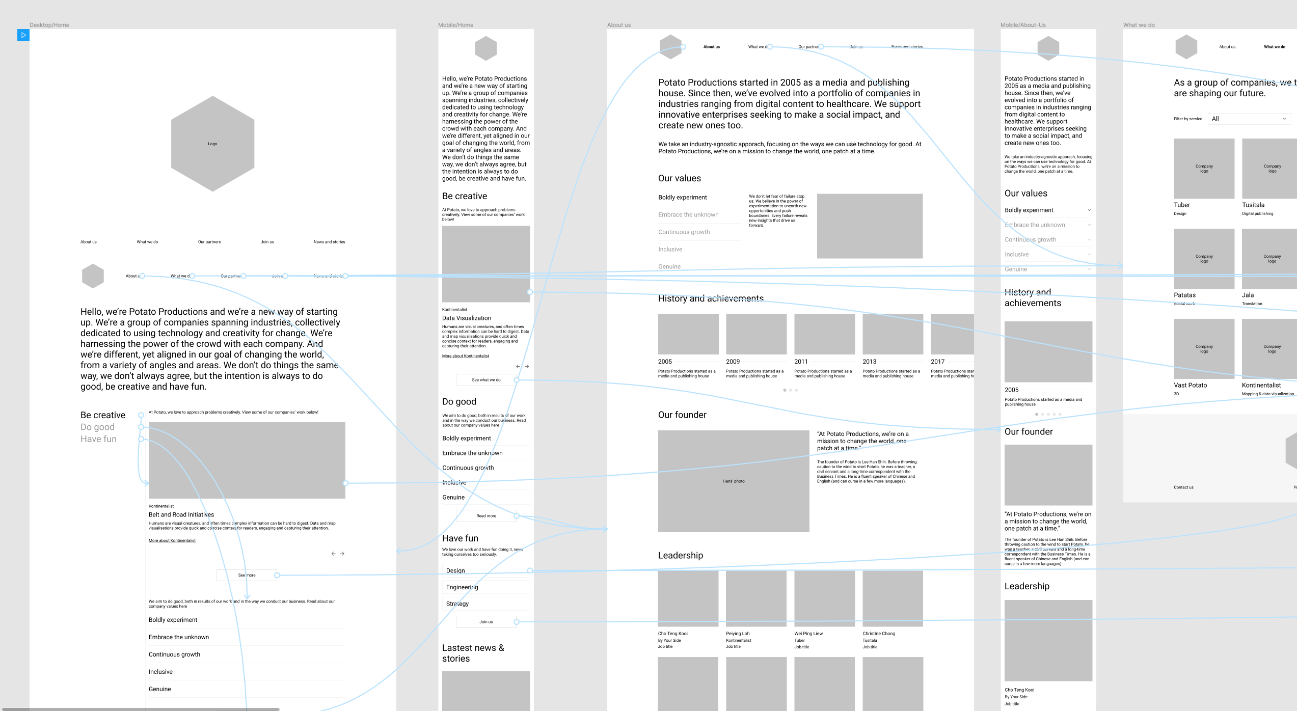
Sitemapping and wireframing
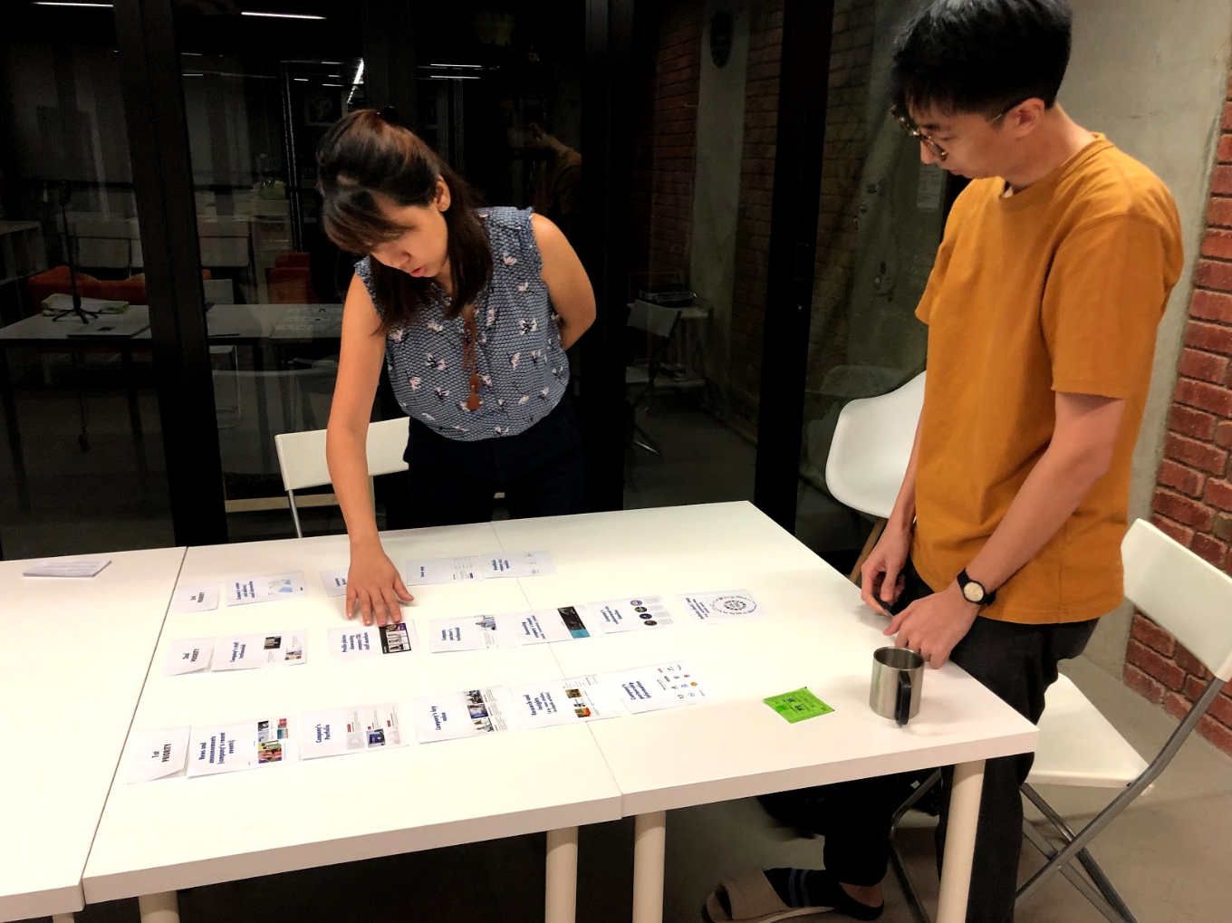
Before we began wireframing each page, we came up with a site map that depicted the content of the website, its structure and the relationship hierarchy between each page.
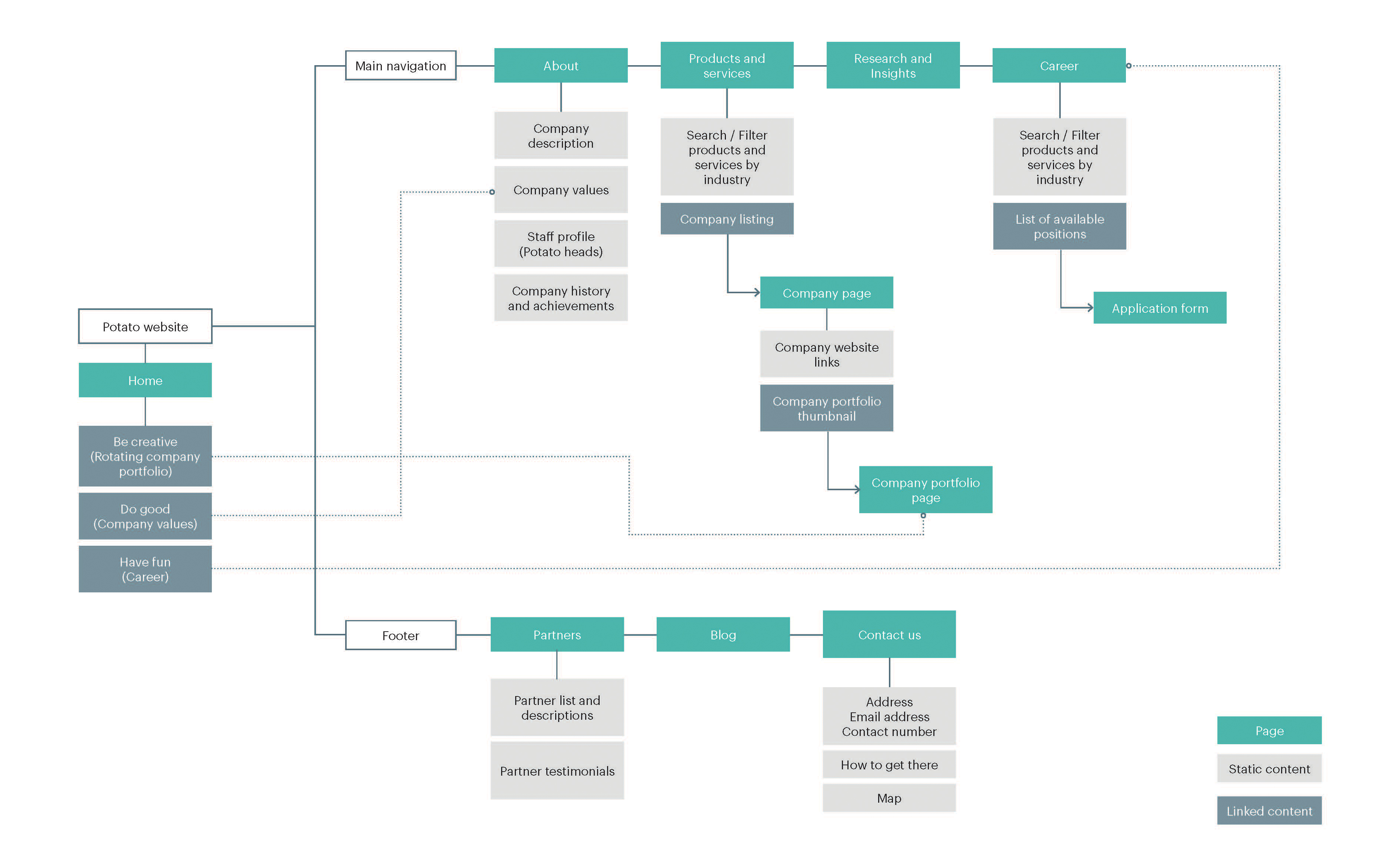
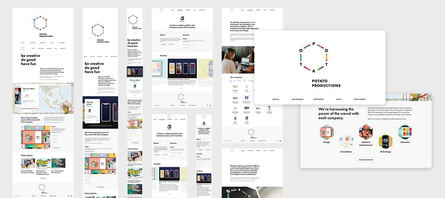
After the sitemap was green lit by the client we immediately moved on to wireframing. At this stage we laid out the content and functionality on each page, which took into account our personas' needs and user journeys. The company portfolio and values were highlighted on the home page since they were highly valued by both personas. In the wireframe, we also presented a rough text copy which later would be developed further by the client.
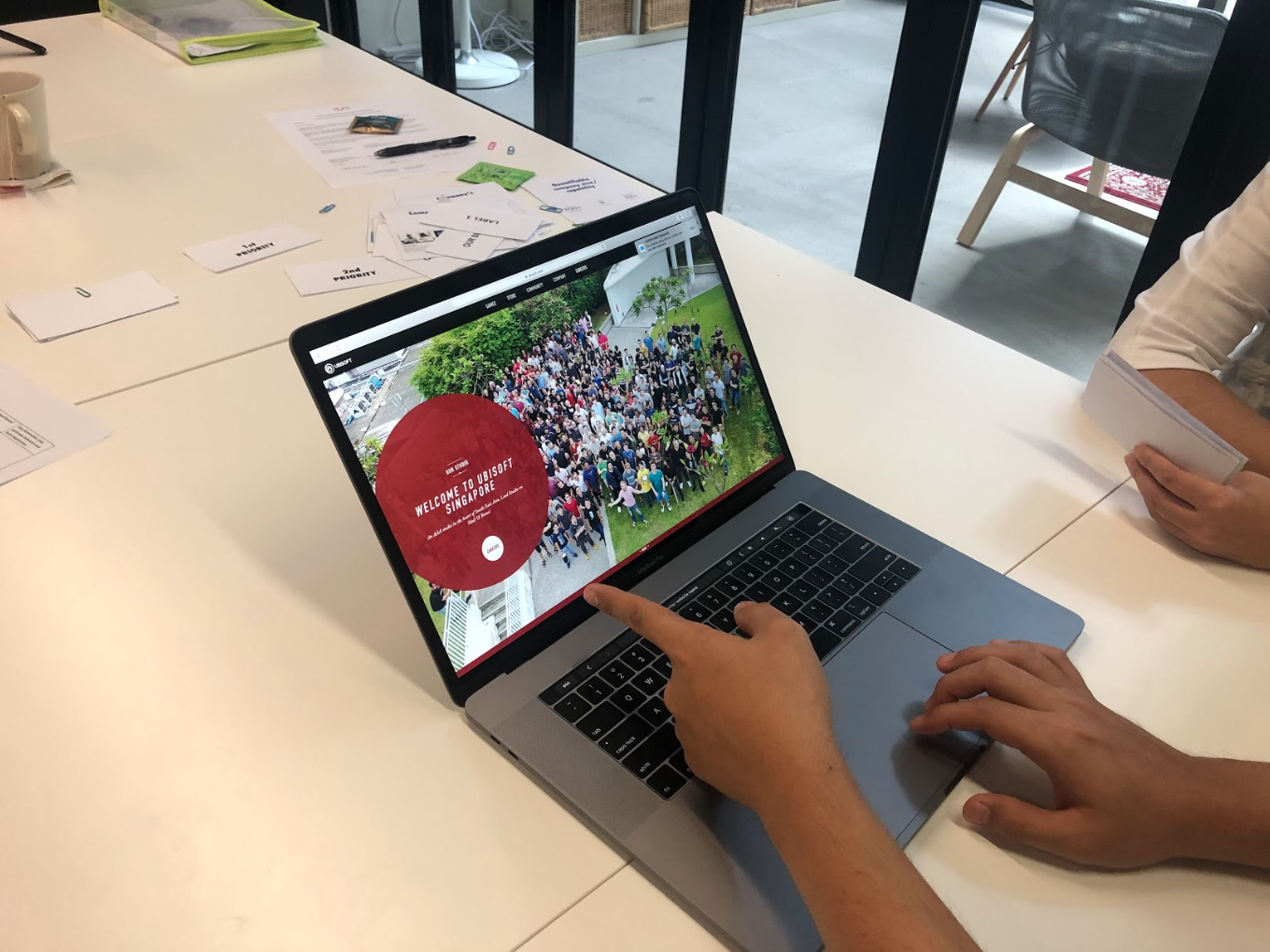
User interface design
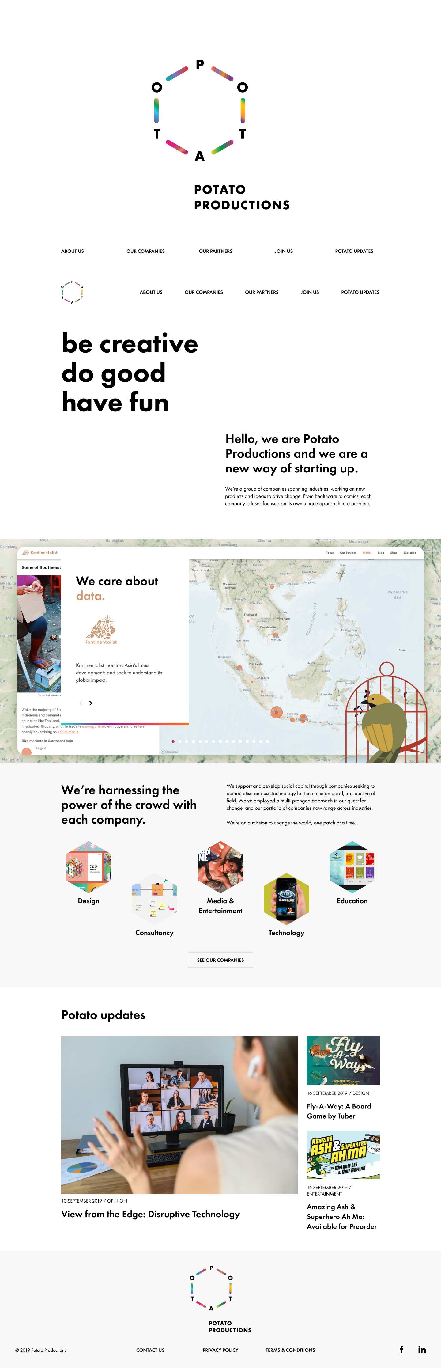
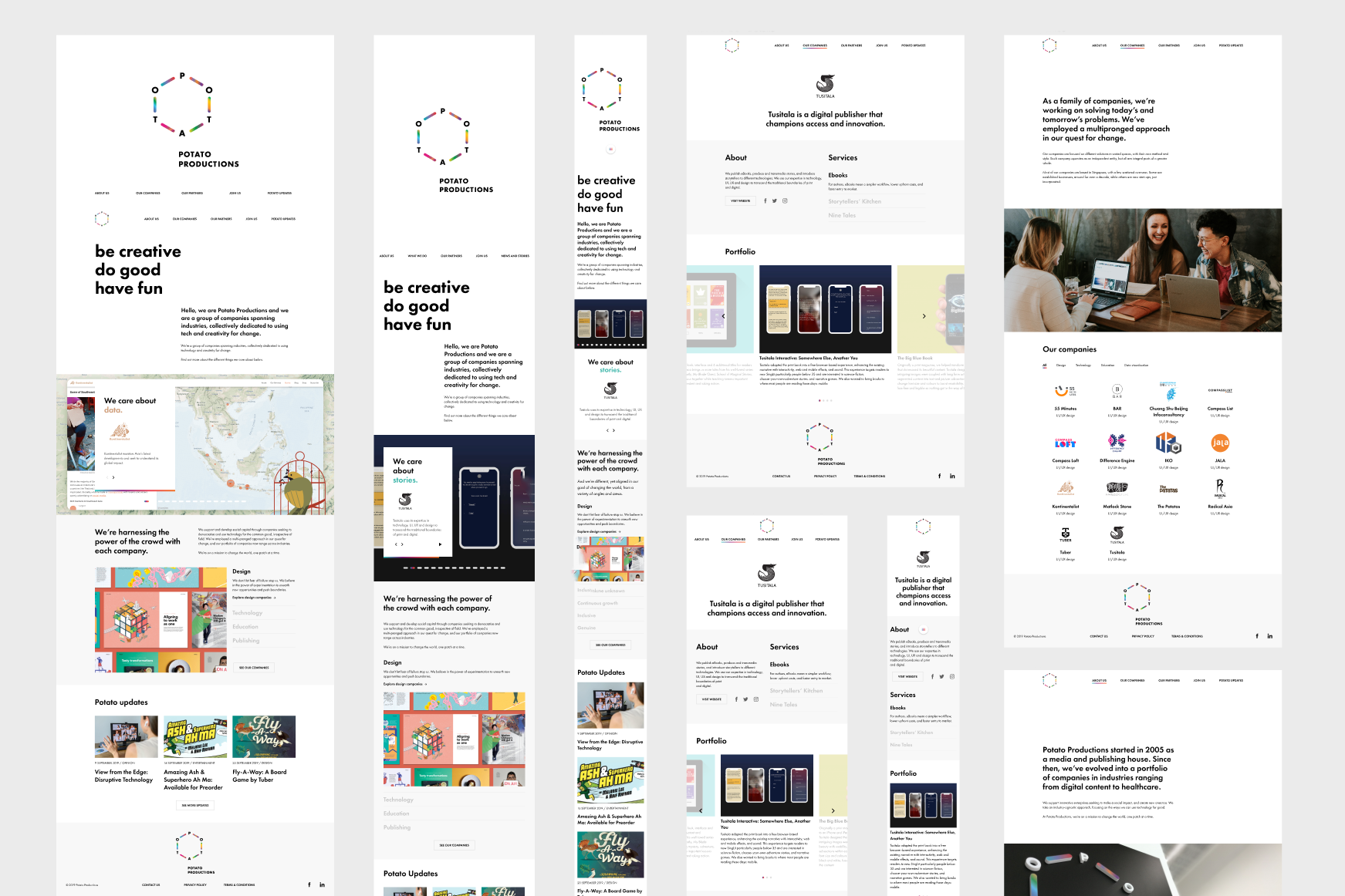
When designing the user interface, we followed Potato’s brand guidelines very closely. The Potato brand is very contemporary and clean, with a strong visual focus on photographs. We instilled the minimalist look of the Potato brand by utilizing a lot of white space, keeping the typography big and bold, and drawing the focus to images and photographs whenever possible.
To add colours to the otherwise monochromatic UI elements, we also took the moving gradients from the Potato Productions logo to denote hover and active elements.
The website was also designed with a lot of user interactivity in mind, such as the sliding" History and Achievements" and "Our Values" section on the "About Us" page to keep it from being too static.
Usability test
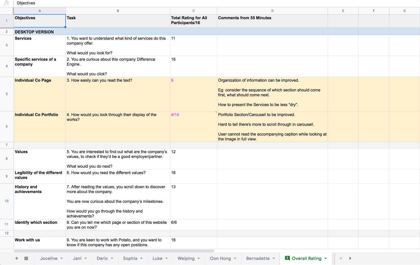
While the website was in production we also conducted a usability test with five users from different age groups who still fit the persona of John Tan and Mei Yi. Two of the usability test participants were returning interviewees. The usability test was conducted online and participants were given a list of scenarios to follow. Half of the participants tested on Chrome while the other half on Safari. All the participants tested the mobile version of the website.
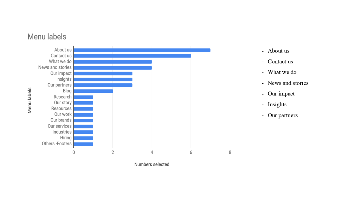
The results of the usability tests pointed out difficulties in navigating the home page and especially the sliders. Other minor issues with the design included font sizes (especially on mobile), spacing, content organization and labelling.
The result
Based on the usability test feedback and feedback from the client and stakeholder, improvements were made to the website. Two of the most problematic pages, namely homepage and the "About Us" page were overhauled, the slider design was vastly improved and some changes in labelling were made in several sections of the website.

