Project brief
Difference Engine is a Singapore-based independent comics publisher with a mission of publishing well-written, beautifully-illustrated comics for a diverse audience. In 2019, Difference Engine partnered with 55 Minutes to redesign its brand identity and website. As a young brand it was important for Difference Engine to set themselves apart from other comic publishing houses, and with that came the need for a strong, distinguishable brand identity. Their brand identity at the time did not reflect their work as a comics publisher. It also lacked the youthful, modern and vibrant look that they need to attract potential young readers. Through the partnership and rebranding exercise, they hoped to obtain a new brand identity and website design that would highlight their innovative, modern, approachable, and fun personality.
Our approach
The logo
The original Difference Engine logomark was made up of two halves of a cog wheel which formed the letter D and E. Even though the logomark was well received, the logotype was difficult to read and the logo quickly became illegible when placed on small spaces. As a comics publisher, the client needed their logo to fit in various book spines, a feat that was impossible with their existing logo.
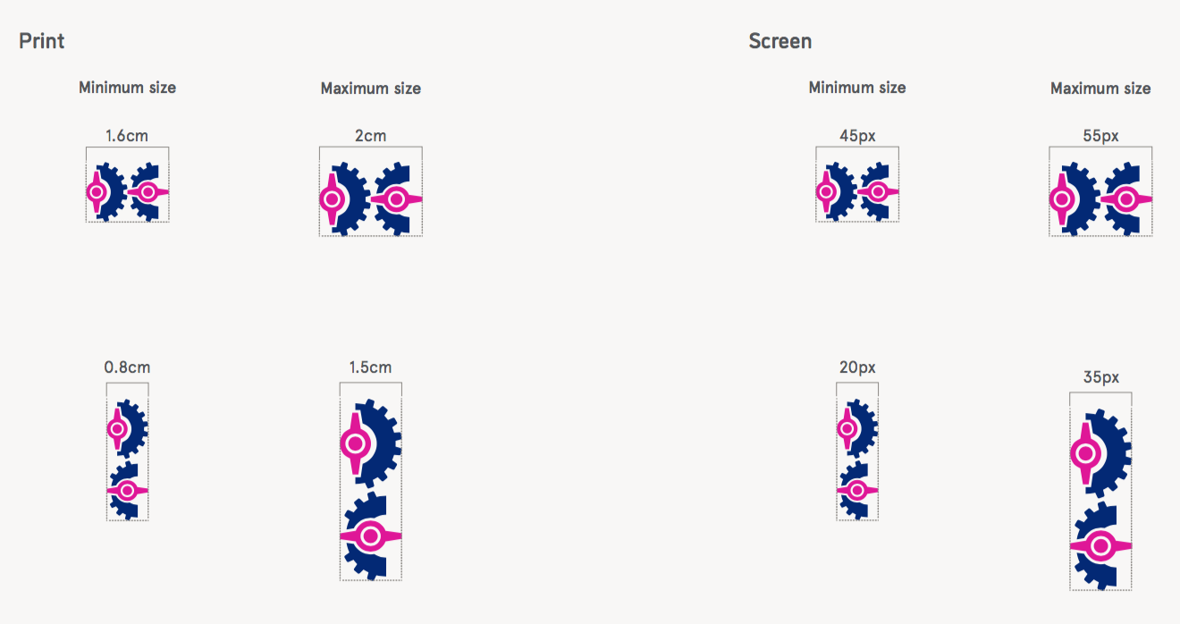
The first part of the rebranding exercise was to resolve the illegibility issue of the logo. The client loved the look of the cogwheels, therefore the main objective of the logo redesign was not to change the logo to another shape or form but to make sure the logo was legible in all screen and print sizes, including a book spine. We simplified the shape of the cogwheels and reduced much of the detail, but 15mm is still a challenging space for two cogwheels to fit in. To solve this issue, we designed a new small format in which the cogwheels are stacked on top of each other to fit the narrow width of 15mm. The logo was also reconstructed to be much more symmetrical instead of having it rely heavily on optical alignment, another problem with the logo that frustrates the client.
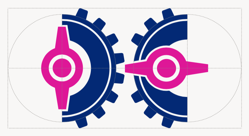
The logo was also given new colour and typeface. The two new colours, navy and magenta, brought about the boldness and energy that were missing from the original logo, while the handwritten typeface played up the playfulness that was needed to attract younger audiences.
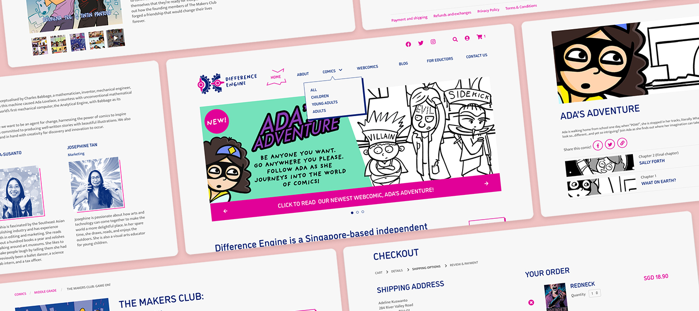
The website
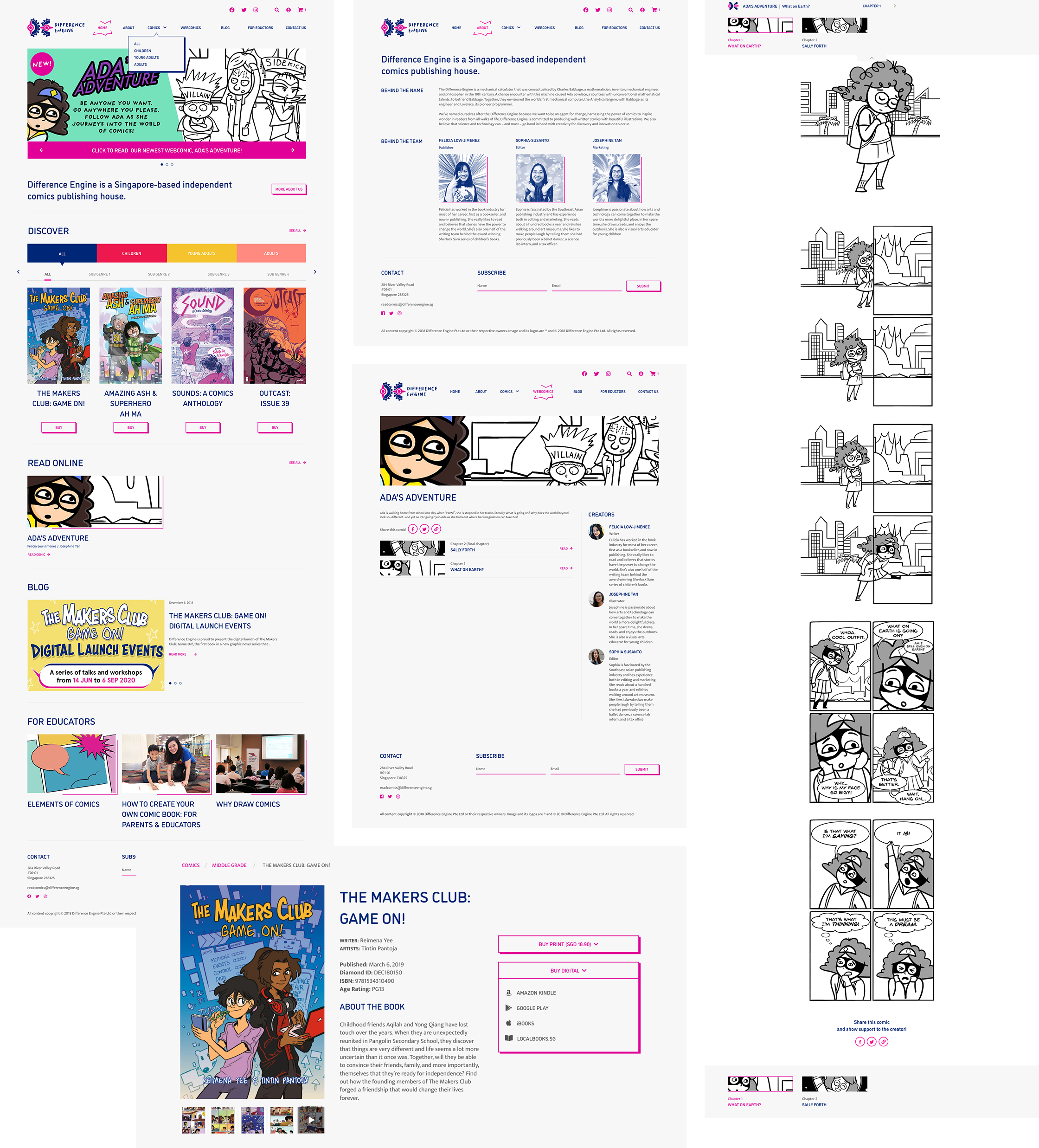
After the new brand identity was finalized, Difference Engine’s existing website was then given an update to conform to its new identity. Most of the basic structure was retained but a new Comics section was added to highlight the upcoming and existing comics that were available for purchase. Many comics-inspired elements were also integrated into the new UI design to emphasize Difference Engine’s nature and work as a comics publisher. The comic elements also added a layer of fun to an otherwise generic website.
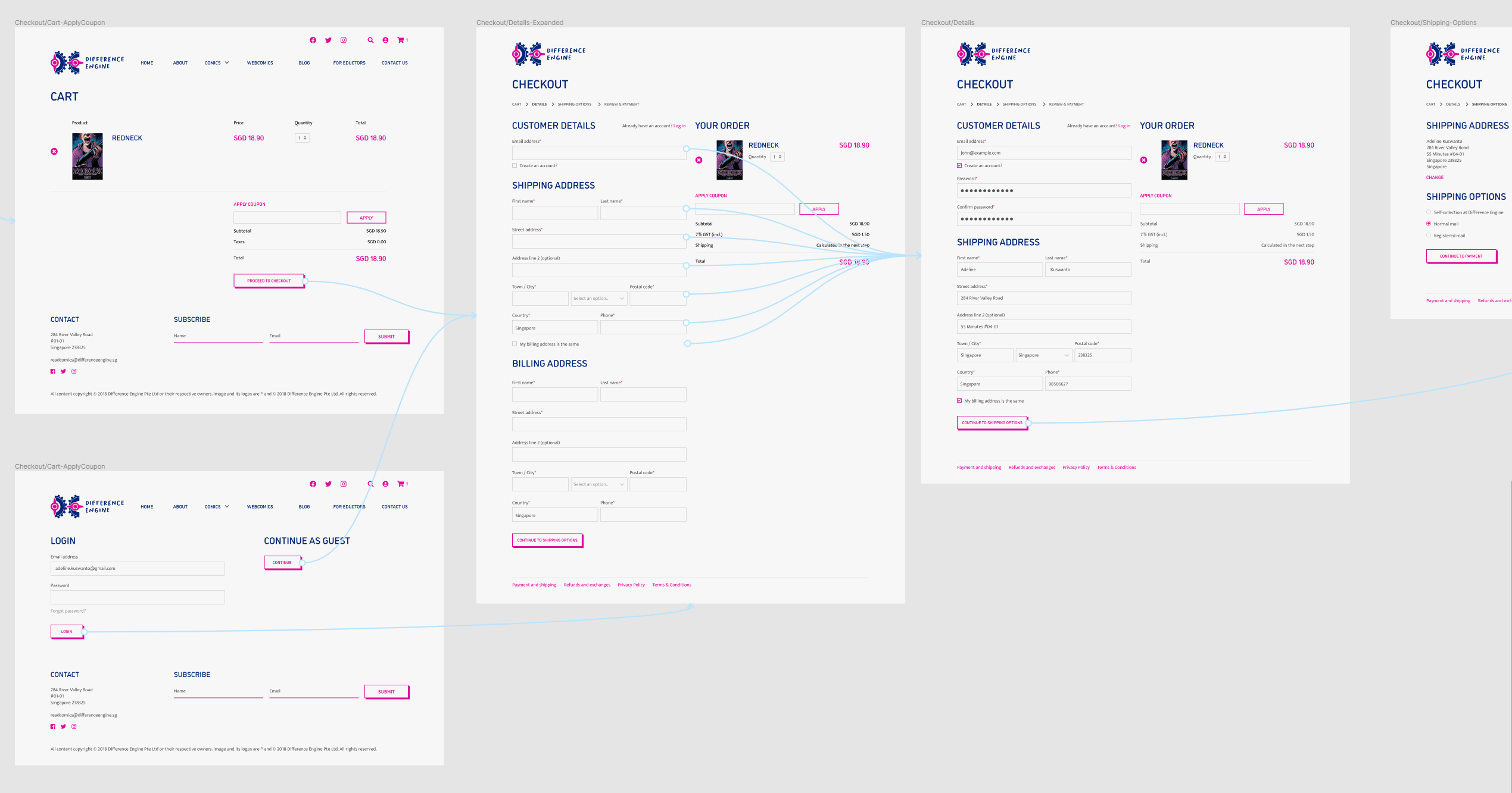
E-commerce
55 Minutes was also in charge of designing Difference Engine’s new e-commerce page. We came up with a user payment flow which closely follows Difference Engine’s choice of e-commerce platform, Woo Commerce.
The result
Through the rebranding exercise, we created a stronger and more consistent brand image for Difference Engine. The new brand guideline has also helped the client apply various branding elements like colours and typography to promotional materials or other branding collaterals. Today the Difference Engine logo can be seen on the various comic books that they’ve released as well.
Overall, the new brand identity and website has received positive feedback from various users—feedback included how the vibrant colours and style suited the company's quirky personality. We are pleased to have had the opportunity to work on the new brand identity and website design for Difference Engine.

